| | Elfar's Art |  |
|
|
| Author | Message |
|---|
Elfar
Senior Moderator


Posts : 1096
UT points : 6569
Join date : 2009-10-26
Age : 27
Location : It's a small world. Who knows?
| | Subject: Elfar's Art Fri Dec 25, 2009 1:17 am | |
| As some of you may know, I've become, well obsessed with Phoenix Wright lately. I made a sig to fit my avatar. So what do you guys think? I actually think this is much better than anything else I've done so far. 
Last edited by Elfar on Sat Dec 26, 2009 5:25 am; edited 2 times in total | |
|
| | |
GaiaAero
Junior Moderator

Posts : 466
UT points : 6398
Join date : 2009-06-09
Age : 29
| | Subject: Re: Elfar's Art Fri Dec 25, 2009 1:22 am | |
| Nice job Elfar, quite an improvement from your previous art. However, here are some tips
Do NOT use red text
It completely kills a signature/banner
The text is pretty boring
Try this website for some more interesting text
Overall, great job. If I had to rate, it'd be a 9.5/10 | |
|
| | |
Elfar
Senior Moderator
Posts : 1096
UT points : 6569
Join date : 2009-10-26
Age : 27
Location : It's a small world. Who knows?
| | Subject: Re: Elfar's Art Fri Dec 25, 2009 3:03 am | |
| - GaiaAero wrote:
- Nice job Elfar, quite an improvement from your previous art. However, here are some tips
Do NOT use red text
It completely kills a signature/banner
The text is pretty boring
Try this website for some more interesting text
Overall, great job. If I had to rate, it'd be a 9.5/10 Wow! Thanks! I'll try getting more fonts. I used red because in the games, when they say "objection", it's in red font. I'll avoid using it now though. | |
|
| | |
GaiaAero
Junior Moderator
Posts : 466
UT points : 6398
Join date : 2009-06-09
Age : 29
| | Subject: Re: Elfar's Art Fri Dec 25, 2009 3:17 am | |
| - Elfar wrote:
- GaiaAero wrote:
- Nice job Elfar, quite an improvement from your previous art. However, here are some tips
Do NOT use red text
It completely kills a signature/banner
The text is pretty boring
Try this website for some more interesting text
Overall, great job. If I had to rate, it'd be a 9.5/10
Wow! Thanks! I'll try getting more fonts. I used red because in the games, when they say "objection", it's in red font. I'll avoid using it now though. No problem. If you need anymore help, feel free to PM me  | |
|
| | |
Elfar
Senior Moderator
Posts : 1096
UT points : 6569
Join date : 2009-10-26
Age : 27
Location : It's a small world. Who knows?
| | Subject: Re: Elfar's Art Fri Dec 25, 2009 3:26 am | |
| - GaiaAero wrote:
- Elfar wrote:
- GaiaAero wrote:
- Nice job Elfar, quite an improvement from your previous art. However, here are some tips
Do NOT use red text
It completely kills a signature/banner
The text is pretty boring
Try this website for some more interesting text
Overall, great job. If I had to rate, it'd be a 9.5/10
Wow! Thanks! I'll try getting more fonts. I used red because in the games, when they say "objection", it's in red font. I'll avoid using it now though.
No problem. If you need anymore help, feel free to PM me Ok, thanks. I'm going to start trying new things and if I have any questions about the art, I'll ask. | |
|
| | |
Elfar
Senior Moderator
Posts : 1096
UT points : 6569
Join date : 2009-10-26
Age : 27
Location : It's a small world. Who knows?
| | Subject: Re: Elfar's Art Fri Dec 25, 2009 4:12 am | |
| I made a new one. Is this one better or worse? 
Last edited by Elfar on Fri Dec 25, 2009 4:20 am; edited 1 time in total | |
|
| | |
GaiaAero
Junior Moderator
Posts : 466
UT points : 6398
Join date : 2009-06-09
Age : 29
| |
| | |
Elfar
Senior Moderator
Posts : 1096
UT points : 6569
Join date : 2009-10-26
Age : 27
Location : It's a small world. Who knows?
| | Subject: Re: Elfar's Art Fri Dec 25, 2009 4:23 am | |
| Alright . I'll leave that one for now. I guess that'll be all for a little while, as I'm kind of tired now. | |
|
| | |
LucasFTW

Posts : 350
UT points : 6029
Join date : 2009-05-25
Age : 27
Location : I am where i'm needed, helping eat cookies.
| | Subject: Re: Elfar's Art Fri Dec 25, 2009 4:24 am | |
| (Meant to be after Gaia's post).
Indeed it is. It seems like you put in effort, and made better effects. I bet you used effects with the other one, but it ended up looking like a gradient.
Oh, and i must ask, what do you use for the bumpy rough effect around the sides (of the blue) that seems to be in most of your effects? | |
|
| | |
Elfar
Senior Moderator
Posts : 1096
UT points : 6569
Join date : 2009-10-26
Age : 27
Location : It's a small world. Who knows?
| | Subject: Re: Elfar's Art Fri Dec 25, 2009 4:29 am | |
| - LucasFTW wrote:
- (Meant to be after Gaia's post).
Indeed it is. It seems like you put in effort, and made better effects. I bet you used effects with the other one, but it ended up looking like a gradient.
Oh, and i must ask, what do you use for the bumpy rough effect around the sides (of the blue) that seems to be in most of your effects? I use that effect because it makes the render have a sort of glow of white around it. It also makes it seem hand drawn, to me at least, which I like as it makes it blend in well with the background. I always use that one, because the first time I used it, I was told that it was the best signature I had made so far. I tried something different with the second one which may be why it's better. | |
|
| | |
Elfar
Senior Moderator
Posts : 1096
UT points : 6569
Join date : 2009-10-26
Age : 27
Location : It's a small world. Who knows?
| | Subject: Re: Elfar's Art Fri Dec 25, 2009 4:41 am | |
| Now I made an avatar to go along with it before passing out. What do you think? | |
|
| | |
Evil

Posts : 1177
UT points : 7656
Join date : 2009-08-13
| | Subject: Re: Elfar's Art Fri Dec 25, 2009 10:01 am | |
| Keep it up  | |
|
| | |
Elfar
Senior Moderator
Posts : 1096
UT points : 6569
Join date : 2009-10-26
Age : 27
Location : It's a small world. Who knows?
| | Subject: Re: Elfar's Art Fri Dec 25, 2009 4:55 pm | |
| Now I made a banner instead of a signature. I tried a gradient color type. Look closely at it, and you'll see carefully done details. It took a long time to make these details. So what do you think?  | |
|
| | |
Evil
Posts : 1177
UT points : 7656
Join date : 2009-08-13
| | Subject: Re: Elfar's Art Fri Dec 25, 2009 5:01 pm | |
| - Elfar wrote:
- Now I made a banner instead of a signature. I tried a gradient color type. Look closely at it, and you'll see carefully done details. It took a long time to make these details. So what do you think?
Make the text a bit more interesting. Maybe make it red [ something nice ]on the blue side and blue on the red side. Green is a bit too random for me.  Now as we get on the render quality, its quite ..choppy. Thats why you use http://www.planetrenders.net/ Make the texture a bit more clear on the background, I cant see it too well, and otherwise that'd be it. Just add MOAR effe smudging on the renders, so it looks like they're blended in. keep smudging  | |
|
| | |
Elfar
Senior Moderator
Posts : 1096
UT points : 6569
Join date : 2009-10-26
Age : 27
Location : It's a small world. Who knows?
| | Subject: Re: Elfar's Art Fri Dec 25, 2009 5:07 pm | |
| | |
|
| | |
Evil
Posts : 1177
UT points : 7656
Join date : 2009-08-13
| | Subject: Re: Elfar's Art Fri Dec 25, 2009 5:09 pm | |
| If I did I'd be sucked in the forums  tl;dr: its alright, keep it up! | |
|
| | |
Elfar
Senior Moderator
Posts : 1096
UT points : 6569
Join date : 2009-10-26
Age : 27
Location : It's a small world. Who knows?
| | Subject: Re: Elfar's Art Sat Dec 26, 2009 5:25 am | |
| I'll just start putting all my art here. Also renamed the topic. I really like how this one turned out, even though I was going for something different. It led me to discover something that will certainly be seen in my later sigs. 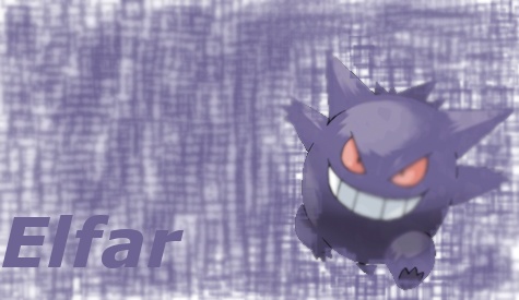 | |
|
| | |
cdplayar

Posts : 1468
UT points : 7943
Join date : 2009-08-10
Age : 27
Location : Ontario, Canada!
| | Subject: Re: Elfar's Art Sat Dec 26, 2009 2:14 pm | |
| - Elfar wrote:
- I'll just start putting all my art here. Also renamed the topic.
I really like how this one turned out, even though I was going for something different. It led me to discover something that will certainly be seen in my later sigs.
It Looks ...
Bland?
Try Making The Text Bolder *Brighter*
Something That Will Make Me Awake | |
|
| | |
Elfar
Senior Moderator
Posts : 1096
UT points : 6569
Join date : 2009-10-26
Age : 27
Location : It's a small world. Who knows?
| | Subject: Re: Elfar's Art Sat Dec 26, 2009 2:24 pm | |
| - cdplayar wrote:
- Elfar wrote:
- I'll just start putting all my art here. Also renamed the topic.
I really like how this one turned out, even though I was going for something different. It led me to discover something that will certainly be seen in my later sigs.
It Looks ...
Bland?
Try Making The Text Bolder *Brighter*
Something That Will Make Me Awake I discovered something from this that will work really well in later sigs. That was the main thing with this. I know this one wasn't the very best, but I also mae it in like 10 minutes. | |
|
| | |
Evil
Posts : 1177
UT points : 7656
Join date : 2009-08-13
| | Subject: Re: Elfar's Art Sat Dec 26, 2009 3:17 pm | |
| And why is half of gengar's body blurred out? | |
|
| | |
Elfar
Senior Moderator
Posts : 1096
UT points : 6569
Join date : 2009-10-26
Age : 27
Location : It's a small world. Who knows?
| | Subject: Re: Elfar's Art Sat Dec 26, 2009 3:26 pm | |
| - Evil wrote:
- And why is half of gengar's body blurred out?
Again a sloppy experiment made quickly. | |
|
| | |
Elfar
Senior Moderator
Posts : 1096
UT points : 6569
Join date : 2009-10-26
Age : 27
Location : It's a small world. Who knows?
| | Subject: Re: Elfar's Art Sun Dec 27, 2009 7:41 pm | |
| I made my first attempt at c4d. I'll post it with and without c4d. With:  Without:  | |
|
| | |
Sponsored content
| | Subject: Re: Elfar's Art | |
| |
|
| | |
| | Elfar's Art | |
|